Animation tutorial
TODO
Best practices
Save often!
This applies to the rest of the editor, too. It's easy to mess up, undo is not always reliable, and in some cases loading an old version is the only sane way to fix a mess.
Proper centering
If you plan to make an animation file that has more than a small handful of animations, it's highly recommended you design your graphics in such a way that the rotation points are centered.
It may seem like a small issue but if you don't do this then you will quickly rack up technical debt that will be a real headache to fix the later you decide to fix it. Therefore try to make ALL your graphics with proper rotation points to avoid the issue altogether. They didn't do this in the base game so most animations actually exhibit this issue.
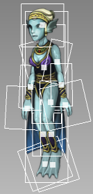
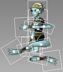
To understand the problem, here's an illustration. These are 3 tiles used in the "mia" animation:
The images have a grey box around them for clarity, and the image centerpoint is marked with a pink dot. When rotated, the image rotates around this point.
On the left, the animation is in its original state. When we try to rotate a couple bones, the joints detach because the rotation is around the center, not where we'd expect the joint to be. This animation frame can be fixed by also adjusting the position of the rotated bones so that the joints again line up properly, but this is prone to look bad when the animation is playing. The only solution is to add more animation keyframes but this is a lot of work.
The lower leg clearly needs to be rendered before the parent (so that the parent is drawn over it; rbp="1" in the XML file), otherwise the blackness around the "knee" would show up and look weird.
Also, there is only one arm tile, so the other arm needs to have fh="1" set, which may cause issues.
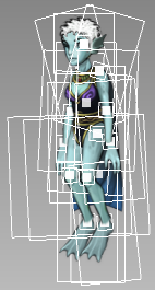
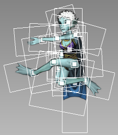
The solution is to pad the graphics with transparency so that the center point is also the point where the joint logically rotates around.
To avoid fh="1", we introduce a second, flipped version of the arm sprite.
The lower leg has also been changed to look better, and render with rbp="0" instead. Naija's legs are very well done to mask the knee transition, use that as a guide in case you design legs.
With this change, the rotation around the joints looks more natural, and no position adjustment is needed:
For a good coomparison, check naija.xml (good) vs. mia.xml or li.xml (bad).
Also note that the head is an exception and doesn't need to be centered on the neck. Just use naija.xml as a reference and it'll be fine.
Fixing this later
In case you decided to ignore this issue until the point where it can't be ignored anymore, or want to change/extend some existing (bad) animations and properly center them, there's a way to do this:
First, modify the graphics of all offending bones so that they are properly centered. Load the animation; it will look messed up. To fix it, pick a pose to use as a reference (usually "idle" is fine), then move all bones back into a good-looking position while holding Ctrl+Shift.
Afterwards, go through all animations and all keyframes and make sure they look good. DON'T hold Ctrl+Shift anymore at this point!! Most should be OK and not require touch-ups, but some will still need manual fixing.
Good luck and don't forget to save often!
Layer passes are global
Try to not use layer passes (ie. anything that is not pass="0") if you can avoid it. If you have some bones rendered in the wrong order,
try to fix it with re-arrangement or changing rbp= of some bones if possible.
If you really do need to set a layer pass that is not 0, keep this in mind:
The layer pass applies to ALL entities in that layer, ie. when the layer is drawn, the passes are drawn in order. That means first the game goes over all entities and all their bones and draws anything that is to be drawn in that pass. Then it repeats that for each pass.
Therefore, don't think about an entity in isolation, think about how it might look when it goes around and mingles with other entities. If you need eg. the front arm to be in front and its bones have a high pass, it will look fine in isolation. But when the entity goes behind another entity, then the arm will still be rendered in front because the game draws all passes separately and the arm goes on a higher pass than anything else. What you'll end up with is a detached looking arm floating in front while the entity it's attached to is covered by something else.
TL;DR Layer passes work best when used in cutscenes and stationary animations, but avoid using this for bone ordering for regular gameplay.
Fun fact: Layer passes were introduced for The Hug (ie. Naija and Li hugging when you leave them alone for a few seconds):
- Naija is always drawn in front of Li.
- To make sure his arm goes over her body when hugging, it's set to a higher pass value while the hug is active, and set back to 0 when the hug ends.
- To see this in action, enter hugging state, then hold Shift+F in developer mode to slow down time, then right-click the pair to break the hug. The arm immediately goes behind her body because the layer pass is reset.
Modify layer passes for single animations
If you need layer passes for an animation, cutscene, or other specific things, you can change a bone's pass on the fly, even mid-animation. Use the AC_SET_PASS and AC_RESET_PASS bone commands for this. If you just need to change the pass for a single animation, put all AC_SET_PASS on the first keyframe.
To make sure the pass settings don't stick and affect other animations played afterwards, add the resetPassOnEnd tag to each animation that uses these bone commands:
<Animation name="special-hugs" resetPassOnEnd="1">
...
</Animation>
This way, you don't have to take care of AC_RESET_PASS or extra scripting to reset the pass back to its original value.


